


Send a designer three website links with the instruction “make it feel modern”, and you leave plenty open to interpretation. You might admire the typography on one site, the navigation on another and only the photography on the third.
A useful website design brief explains those distinctions. It connects your references to visitors’ needs and gives the designer enough direction to explore suitable solutions.
Set out the project and the visitor’s task
Start with the business background, intended audience, main pages, essential functionality and available content. Record the budget, timing and who approves decisions. These establish the boundaries of the work; visual references help explain the direction within them.
Describe the desired outcome as something a visitor needs to accomplish: choosing the right service, finding opening hours or submitting an enquiry. Draw on genuine customer questions or existing research, and identify assumptions that still need checking.
A web design agency Manchester businesses work with needs the reasoning behind each reference: which visitor task it supports and which feature is worth adapting. That connection helps the designer interpret your preferences in the context of the project.
Annotate the features that matter
Choose a small set of references, each demonstrating a distinct point. Several nearly identical homepages offer less direction than examples covering navigation, service information and contact options.
For each reference, record the page URL, identify the feature and explain the visitor need it addresses. Add what to retain, change or avoid. A navigation note should highlight the grouping or labels that make services easy to find, rather than simply describing the menu as “clean”.
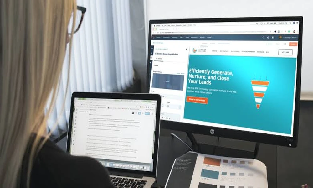
Include a screenshot with the relevant area marked, and specify whether it shows desktop or mobile use. The screenshot preserves what caught your attention; the link lets the designer examine its behaviour and surrounding content.
Be selective within each example, too. You can value a page’s clear hierarchy while ruling out its animation or dense imagery. Make that distinction beside the reference, where it is easy to find.
Test each idea against your real content
A spacious layout built around a short headline can feel quite different when filled with long service names and explanatory copy. Compare the reference with material from your own business before making it a requirement.
Try a representative heading, paragraph and photograph. Consider how the layout would handle extra lines, different image proportions or a service that needs more explanation than its neighbours. If the design depends on large original photographs, record whether suitable images exist or need producing.
Then inspect the reference on a phone. Follow its navigation, read the text and find the contact options. Note the underlying principle worth retaining, such as clear grouping or readable headings, while leaving room for a different arrangement on smaller screens.
Separate requirements from preferences
Tell the designer which decisions are fixed and which remain open. Three labels can keep the visual-direction section straightforward:
- Essential: visitors must be able to distinguish the main services.
- Preferred: restrained colours and generous spacing.
- Explore: alternative ways to present related services.
Keep the outcome separate from the proposed solution. Clear service selection is a requirement; cards are one possible way to achieve it.
When stakeholders disagree, ask each person to explain how their preference serves the visitor. Record unresolved choices as questions, with someone responsible for resolving them. Consolidate feedback into one agreed version so the designer receives a coherent direction rather than competing instructions from separate conversations.
Show the direction in a worked example
Consider a hypothetical maintenance business preparing a redesign brief. Its visual-direction entry could turn “we like this homepage” into something more useful:
> Visitors need to distinguish emergency repairs, planned servicing and installation work. The reference groups its services under clear headings, which is the principle to retain. Use our actual service descriptions and allow room to explain each option. Develop the design using our own photography, wording and colour scheme.
>
> Clear service selection is essential. Cards are preferred, but explore another layout if it makes the differences easier to understand on mobile.
Attach the annotated reference and a sample of the business’s real content.
Before sending the brief, ask whether someone unfamiliar with your saved websites could explain the intended direction and its priorities. If they still have to guess which parts matter, revisit the annotations. Start with one reference and make it clear enough to guide a design decision.
